Statistics are important figures to perceive common conditions when working
with data. Some statistics parameters like
average, median, variance, standard deviation and many more are used to
get a general overview from data. Example, from 365 daily temperature
data for a region within a year, it will be difficult to get a common sense
from it. Therefore we use those statistics figures like minimum and maximum
temperature, average temperature, variance, etc to get a quick overview.
As we know, a raster data contains pixel values that represent a specific
variable. To get an overview about a raster value, we can use a
raster statistics tool. But how to get raster statistics parameters
based on polygon regions in a vector layer? I will discuss it in this tutorial
and also plot the result in a graph as in figure 1.
Figure 1. Average NDVI for multiple local areas
Raster Statistics by Vector Polygon Calculation
For this tutorial I used NDVI data and a local area boundary which contains 22
polygons from the city of Vancouver. The vector data can be downloaded from
Vancouver Open Data Portal
and the NDVI was calculated in Google Earth Engine (GEE) platform. If you're
interested how to calculate spectral indices in GEE, check out this
post:
How to Calculate Various Spectral Indices in Google Earth Engine Quickly
Now let's see how to calculate raster statistics by vector layer in QGIS.
Firstly add a raster and a vector layer that contains some polygons. In figure
2, can be seen I added a NDVI raster and a local boundary polygon as mentioned
before.
Figure 2. Raster and Vector Data
Open the Processing Toolbox. In the search, type a keyword
statistics. All tools that relate to this keyword will appear. Choose
v.rast.stats from GRASS as in figure 3.
Figure 3. v.rast.stats tool
In the v.rast.stats tool window as in figure 4, select the vector
polygon, raster data and specify a prefix for new generated statistics
field(s).
Figure 4. v.rast.stats window
Next in The methods to use option. There are 13 statistics parameters
that will be computed. You can check/uncheck the option to calculate only
certain parameters as in figure 5.
Figure 5. Statistics Parameters
That's all what you need to play in the v.rast.stats tool window.
After running the tool, a new vector layer with all computed statistics
parameter fields will be added into the map. Figure 6 is the preview
of the attribute table from the new added layer. What can you observe?
Is there something wrong?
Figure 6. Statistics parameters in attribute table
Yes, there is something wrong with it. Now there are 90 rows/polygons. It
must be 22 polygons. Where are these new rows coming from? Honestly, I don't
know. But fortunately, if you observe the value, they are all the same. To
get rid of this, we can dissolve it based on a statistics parameter field.
Moreover, I think it does not happen not for all cases, so it's better to
check it before you're doing a dissolve operation.
Dissolve Operation
To do a dissolve operation, from the top menu select
Vector > Geoprocessing Tools > Dissolve... as shown in figure
7. Then from the Dissolve window select input vector and a field as
in figure 8.
Figure 7. Dissolve tool
Figure 8. Dissolve tool window
Now you should get a right number of polygon area as in the following
figure.
Figure 9. Attribute table after dissolve
Plotting The Graph
Congratulations! It's done. You've computed raster statistics based on
vector polygon to get some parameters for each polygon as in figure 9. But
we won't stop here. Because it's not easy to compare each figure in a table
with many rows. So let's create a graph to make it easier to see the
difference among them.
To create a graph in QGIS we use the Data Plotly plugin. It's not
installed by default. Therefore you have to install it from
Plugin >Manage and Install Plugins.. menu and make sure
it's checked as in figure 10.
Figure 10. Enabled Data Plotly Plugin
Open Data Plotly plugin by clicking the icon in the toolbar. The
Data Plotly window should appear as in figure 11. From the window
select a plot type. In this case I want to create a scatter plot.
Then select the vector layer. Next define x and y fields. In
the next section you can type a title for the legend. Because I want to make
a line graph with points, so in the Marker type option I chose
Points and Lines.
Figure 11. Data Plotly window
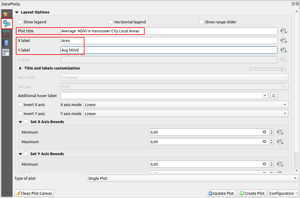
Next, in the Layout options you can set a title for the graph and set
x and y label as seen in figure 12.
Figure 12. Data Plotly layout options
After this step, you can create the graph by pushing
Create Plot button in the bottom of the window and you should get a
graph like figure 1.
That's all the tutorial on how to calculate raster statistics by vector
layer in QGIS. We already discussed how to get raster statistics for each
polygon in a vector layer using the v.rast.stats tool from GRASS and
plot a graph to visualize it using the Data Plotly plugin. Thanks for
reading!