Let's start this tutorial by adding the data into QGIS map canvas using the following code.
1 2 3 4 5 |
#Point vector data crime_layer=QgsVectorLayer("/media/Data_GIS/crime.shp","crime","ogr") #Add a single layer QgsProject.instance().addMapLayer(crime_layer) |
After running the code, the data should be added into a layer which is called crime as seen in the figure 1.
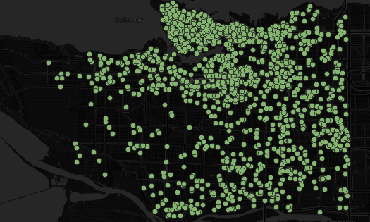 |
| Figure 1. Point Data |
Now let's visualize the data in a heatmap style with QgsHeatmapRenderer class. Therefore we define a variable for the class as in the following code. The vector setRenderer method is used to apply the heatmap style, and triggerRepaint method is used to update the view.
1 2 3 4 | #Heatmap Renderer heatmap = QgsHeatmapRenderer() crime_layer.setRenderer(heatmap) crime_layer.triggerRepaint() |
Running the code, the heatmap should be seen as in figure2.
 |
| Figure 2. Heatmap in Grayscale Gradient |
The heatmap is there, we can see it. It's in a grayscale gradient where minimum value is white and maximum is black. The gradient color can be changed with the colorRamp method from the QgsStyle class.
1 2 3 | #Color Ramp col_ramp = QgsStyle().defaultStyle().colorRamp('Spectral') heatmap.setColorRamp(col_ramp) |
The name of the color ramp is defined in the colorRamp method. In the code above I use Spectral with color gradients starting from red as minimum value to blue for maximum. Figure 4 shows the color ramp name and it's color variation.
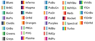 |
| Figure 3. Color Ramp Variation |
Using the Spectral color gradients the heatmap now is like figure 4.
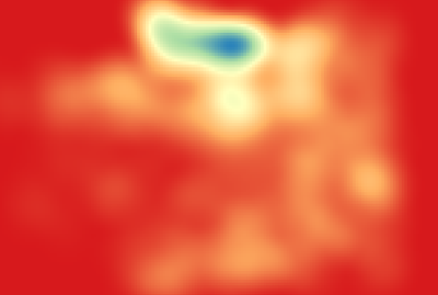 |
| Figure 4. Heatmap with Spectral Color Ramp |
It looks nicer. But I want the red for maximum color and blue for minimum, because it's more intuitive to represent high value with reddish color and low with the bluish one. It can be done by inverting the color.
#Inverting Color Ramp
ramp.invert()
Figure 5 shows the Spectral inverting color. Blue becomes minimum and red as maximum.
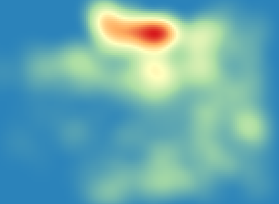 |
| FIgure 5. Heatmap with Spectral Invert Color Ramp |
The minimum color covered all the map extent. This is something we don't want, because it is hiding other layers behind it. To get rid of this, the minimum color needs to be transparent. This can be done with the setColor1 method of color ramp as the following.
#Change Minimum Color
ramp.setColor1(QColor(43,131,186,0))
The setColor1 method takes QColor argument with the attribute Red, Green, Blue and alpha/opacity. Figure 6 shows the heatmap with transparent minimum color.
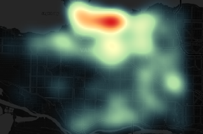 |
| Figure 6. Heatmap with transparent minimum color |
That's all this tutorial on how to create heatmap in QGIS using Python. We learned how to add point vector data into a QGIS map canvas, create a heatmap, change the color ramp, invert color and change the color transparency. There are more methods available for heatmap renderer class. If you want to find out more, please check out the PyQGIS API Documentation.
For other interesting PyQGIS tutorials please visit PyQGIS Tutorial Series. Thanks for reading!